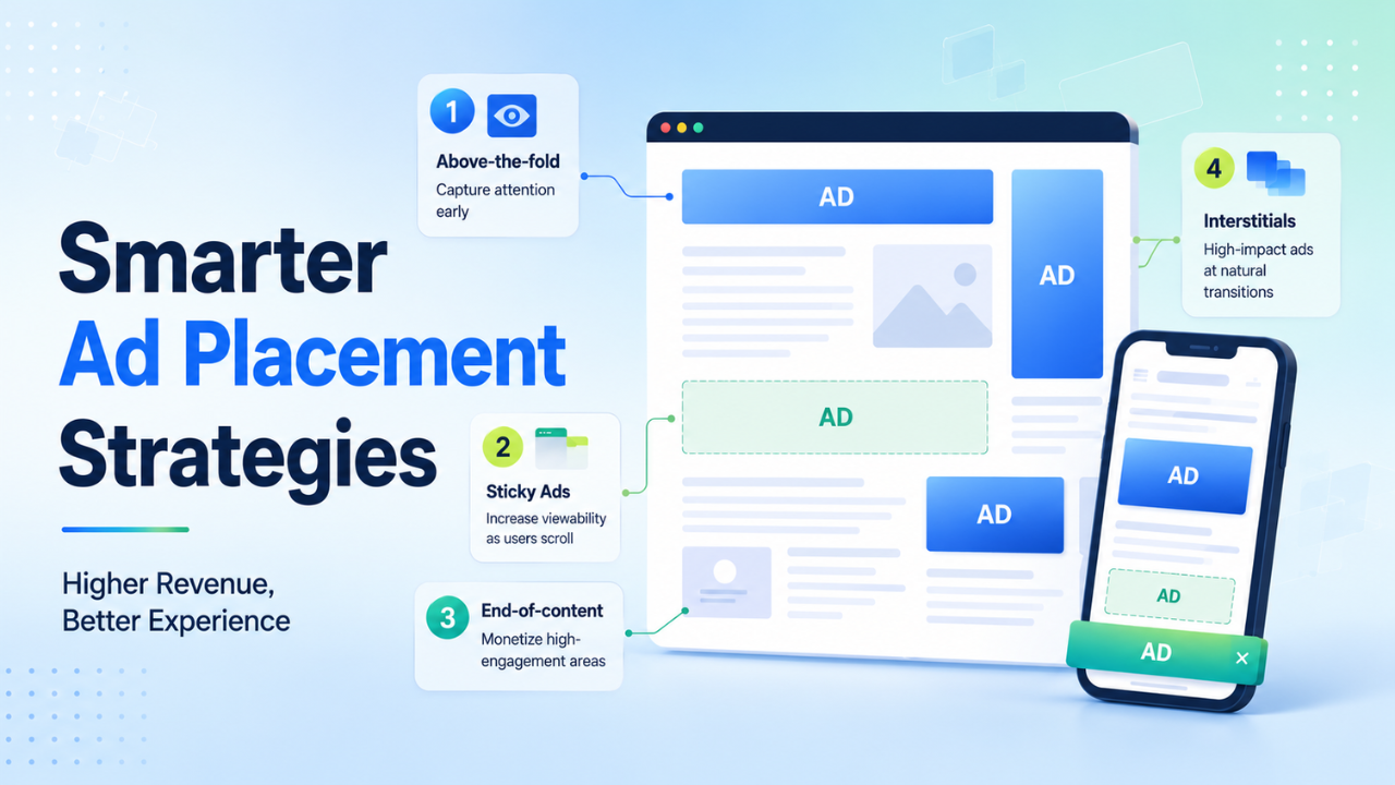


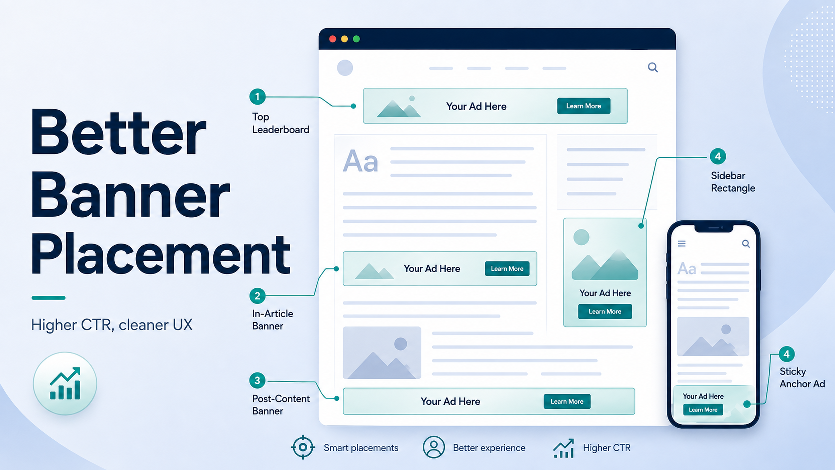
Getting more clicks from banner ads does not mean placing more banners. The most effective high CTR banner ad placements tend to appear where readers naturally pause, finish a thought, or decide what to do next. These positions make an ad easier to notice without forcing it into the user’s path.
The challenge is separating genuine engagement from accidental clicks. A banner placed too close to navigation, download buttons, interactive elements, or moving content may produce a temporary CTR spike while creating a poor user experience. Google specifically warns publishers against implementations that can cause users to mistake ads for site controls or content. (Google Help)
A better strategy combines strong viewability, natural reading behavior, clear spacing, and responsive layouts. The five placements below give publishers practical starting points for improving banner performance while protecting page usability and long-term inventory quality.
Table of Contents
The CTR vs. UX tradeoff: why aggressive banner stuffing fails
High CTR is useful only when the click reflects real user intent.
Google’s Confirmed Click system can add an additional confirmation step when its systems detect that a placement may be generating unintended clicks. It is better understood as a protection mechanism than a simple “CTR penalty.” Google may ask users to confirm that they actually want to visit the advertiser before the click continues. (Google Help)
Layouts can become risky when an ad sits beside a menu, play button, “Next” link, download button, form control, or another element users frequently tap. Google also advises publishers to keep proper distance between advertising and content or interactive elements. (Google Help)
The goal should therefore be organic CTR. Instead of pushing ads into the reader’s interaction path, place them around natural pause points where attention temporarily shifts away from the main content.
This principle becomes especially useful when optimizing ad placements for fast-exit traffic, where publishers have fewer opportunities to monetize each visit without making the first screen excessively ad-heavy.
Read more: How to optimize ad placements for Google Discover traffic (High CTR, fast exit)
Top 5 high-CTR banner ad placements
For most editorial websites, these five positions offer a strong balance between visibility, intent, and usability:
1. Post-introduction in-article card
Place the first in-article banner after approximately 100 to 150 words, often after the second or third short paragraph and before the first major H2.
At this point, the user has already confirmed that the page is relevant and is about to move from the introduction into the main content. That creates a natural visual pause without interrupting the opening message immediately after the page loads.
A responsive rectangle such as 300×250, 336×280, or a fluid responsive unit can work well depending on the available width.
Keep visible separation between the ad and the following heading. A practical starting point is around 20 to 24px of vertical spacing, then test it across screen sizes. This is a UX recommendation, not an official Google minimum.
2. Sticky bottom mobile anchor
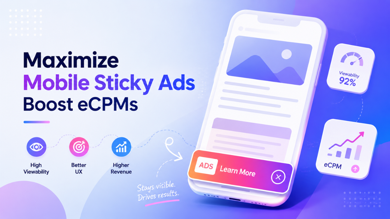
A sticky bottom banner keeps a relatively small ad unit visible near the bottom edge of a mobile screen while the user scrolls.
Because the placement remains within the viewport, it can become one of the site’s high viewability ad units. Google defines a standard display impression as viewable when at least 50% of the ad is visible for at least one continuous second. (Google Help)
Common mobile banner sizes include 320×50 and 320×100, although responsive implementations may adapt to the available viewport.
The anchor must not cover navigation, article controls, consent interfaces, or other important UI. Horizontal sticky ads should also remain clearly differentiated from content and should not come too close to navigation or other ads. (Google Help)
If the implementation includes a dismissal control, keep it obvious and easy to use rather than hiding it near the ad creative.
3. Mid-article responsive box
Long-form content often creates another useful monetization point around the middle of the article.
Instead of inserting the banner after an arbitrary number of paragraphs, look for a meaningful content break. Good examples include the end of a major section, a key takeaway box, a comparison block, or the transition between two related ideas.
A centered 300×250, 336×280, or responsive box usually fits both mobile and desktop layouts without becoming visually dominant.
This placement can perform well because the reader has already invested time in the article. However, engagement depth alone does not guarantee higher CTR. Track both Active View and interaction quality before deciding that the unit deserves more demand or a larger creative.
4. Sticky sidebar half-page unit
Desktop layouts with a wide content column and separate sidebar can support a sticky 300×600 unit.
The format has two advantages. First, the larger creative gives advertisers more space for visual messaging. Second, the sticky behavior keeps the placement available as the reader moves through a longer article.
Google notes that vertical ad sizes can perform well for viewability, but sticky units must not overlap content, navigation, scrollbars, or other advertising. They should also remain stable while the user scrolls. (Google Help)
Set clear start and stop boundaries for the sticky container. For example, allow it to become sticky only after the top sidebar content has passed, then release it before the footer, comments, or related-content modules.
On narrow screens, disable the desktop sidebar placement instead of forcing it into a mobile layout.
5. Post-content action unit
The space immediately after the article conclusion and before comments or related posts is another useful natural pause point.
Readers who reach this position have completed the main content and are deciding what to do next. Some may open a related article, return to navigation, leave the page, or engage with a relevant advertisement.
The placement is less intrusive because it does not interrupt the reading flow. It can also monetize highly engaged sessions without adding another banner inside the body.
Keep the advertising clearly identifiable. If you add a publisher-created label above a Google ad, Google permits labels such as “Advertisement” or “Sponsored links” and warns against headings that could mislead users about what the ad represents. (Google Help)
Placement performance comparison matrix
There is no universal CTR or viewability benchmark that applies to every publisher. Traffic source, GEO, device mix, content category, advertiser demand, page speed, and user behavior can change results substantially.
A more useful comparison is the relative performance potential of each placement:
| Ad placement | Best device | CTR potential | Viewability potential | Accidental-click risk |
|---|---|---|---|---|
| Post-introduction | Mobile & desktop | High | High | Low |
| Sticky bottom anchor | Mobile | High | Very high | Low to medium |
| Mid-article box | Mobile & desktop | Medium to high | Medium to high | Low |
| Sticky sidebar 300×600 | Desktop | High | Very high | Low |
| Post-content unit | Mobile & desktop | Medium to high | Medium | Low |
Publishers should use their own Active View, CTR, RPM, session depth, and user-engagement data as the real benchmark. An increase in CTR should not automatically be considered a win if bounce rate, page depth, viewability, or invalid-click signals move in the wrong direction.
Spacing and mobile layout rules for non-intrusive banner placements
Non intrusive banner placements need enough visual separation to make their purpose obvious without creating large empty areas around the content.
A useful starting point is 20 to 24px of vertical spacing around in-content units. Increase the distance around high-interaction elements such as forms, gallery arrows, video controls, navigation, download buttons, or game interfaces.
Google does not publish a universal pixel minimum for these situations. Its policy focuses on avoiding layouts that encourage accidental clicks and keeping ads sufficiently separated from controls that users may intend to interact with. (Google Help)
For mobile banner layout UX, also test the page at smaller viewport widths. A layout that looks safe on a 430px-wide phone may become cramped on a narrower device.
Pay particular attention to:
- Sticky navigation: The banner should not collide with a site’s bottom navigation or floating action buttons.
- Consent interfaces: CMP buttons and privacy controls should remain completely accessible.
- Responsive creatives: The ad should stay inside its intended container without creating horizontal scrolling.
- Touch targets: Users should never need to tap through a narrow gap between an advertisement and another interactive element.
The purpose of spacing is not to make ads invisible. It is to make the difference between advertising, content, and site controls immediately clear.
Technical guidelines to prevent Confirmed Click and layout issues
Good placement design also depends on how the ad is implemented:
- Reserve ad space before loading: Define an appropriate
min-height, fixed slot size, oraspect-ratiofor the ad container. Reserving space for late-loading ads can reduce unexpected layout movement and help control CLS. (web.dev) - Keep interactive elements away from ad boundaries: Do not place ads directly beside navigation, “Previous/Next” buttons, download links, play controls, dropdowns, or other frequently tapped elements. This is one of the most important ways to prevent accidental clicks on Google inventory. (Google Help)
- Lazy load lower-page units: For placements further down the article, loading the ad closer to when the user approaches it can reduce unnecessary requests and improve viewability. Google also recommends appropriate lazy loading as a way to improve viewability. (Google Help)
- Treat ad refresh separately from placement: If inventory refreshes through Google Ad Manager, the refresh behavior must be declared correctly. For web inventory, Google allows event-driven and time-based refresh declarations with a minimum interval of 30 seconds, but longer exposure can make the inventory more attractive to buyers. (Google Help)
A 30-second minimum should not automatically become the publisher’s refresh strategy. Refresh only when the ad remains eligible, visible enough to create value, and the implementation complies with every demand partner involved.
For a deeper setup guide, see smart ad refresh best practices.
Internal link: Ad refresh best practices: How to multiply page impressions without hurting eCPM
How to test the best ad placements for high CTR
CTR should be one metric in the experiment, not the optimization target by itself.
Start by testing one placement change at a time. Moving the first in-article ad while simultaneously adding a sticky anchor and changing refresh logic makes it difficult to identify what actually affected revenue or engagement.
Measure at least these signals:
- CTR: Check whether users are interacting with the creative more often.
- Active View: Determine whether the placement is actually producing viewable impressions.
- Page RPM: Confirm whether higher engagement translates into meaningful publisher revenue.
- Session depth: Watch for changes in pages per session, scroll depth, and article completion.
- Layout performance: Monitor CLS and other Core Web Vitals after changing slot dimensions or loading behavior.
Google notes that viewability depends on the site, content, layout, and user behavior, which is why testing should happen at the publisher level rather than relying on a universal placement formula. (Google Help)
For publishers managing many layouts, GEOs, and demand sources, a managed monetization partner can also help evaluate placement-level viewability, revenue contribution, and UX tradeoffs. PubFuture can support this type of testing without making CTR the only success metric.
Implementation checklist for publishers
Before adding more banner inventory, review the placements already available on the page:
- Check the first in-article banner. Test whether placing it after the introduction creates a cleaner pause point than loading an ad immediately beside the opening content.
- Review the mobile anchor. Make sure sticky inventory does not cover navigation, consent controls, or content and remains stable across common mobile viewport sizes.
- Reserve space for every major ad slot. Use CSS dimensions,
min-height, or other layout techniques to reduce shifts when creatives arrive. - Inspect every nearby interactive element. Give extra separation to buttons, menus, galleries, video controls, download links, and other high-touch areas.
- Compare revenue with engagement. Evaluate CTR together with Active View, Page RPM, scroll depth, and user behavior before rolling a layout change across the entire site.
Three or four well-positioned units can often create a cleaner monetization setup than filling every available gap with another banner.
The best high CTR banner ad placements work because they fit the user’s reading journey rather than interrupting it. Post-introduction units, mobile anchors, mid-article boxes, desktop sticky sidebars, and post-content placements each create different opportunities to improve visibility while keeping accidental-click risk under control.
Publishers should treat placement optimization as an ongoing balance between viewability, genuine engagement, revenue, and UX. If you want to evaluate whether your current banner setup has room for stronger demand or better placement optimization, explore website monetization opportunities with PubFuture.